Saturday, 3 March 2012

5 Lessons DrawSomething teaches on Visualization for Presentation

5-Lessons-DrawSomething-teaches-on-Visualization-for-Presentation

Draw Something is now one of the hottest apps in the world, and have just secured its 5,000,000 downloads a few days ago. The trend has reached Hong Kong recently, so i have given it a chance and see how it works. The game play is definitely fun and engaging as mentioned by the reviews, but what surprised me is that, the draw-&-guess model, or simply "the Pictionary game", is indeed involving some quite important concept that one could easily leverage for more effective presentation through abstractive drawing. Here's some tricks that you may find useful (for presentation or just getting more coins in Draw Something!!).

Enjoy. :)

Tuesday, 28 February 2012

4 Approaches to Estimate Cost for Multi-Channel in Google Analytics

4 Approaches to Estimate Cost for Multi-Channel in Google Analytics

In last post we have explored how to leverage the Assisted Conversion Reports in Google Analytics for advanced analysis based on ROI. Special thank to Shailendra Dubey in pointing out a missing puzzle in that article, which is, before calculating the Return On Investment, we have to know the Total Cost Spent on each of them. So let's have a quick post to discuss about my practice in estimating the cost of different channels.


In general, we have 4 approaches to deal with the costing problem....

Sunday, 26 February 2012

16 Pinterest-Clones in China (and More's Coming) !!

16 PInterest-Clones in China (and More's Coming) !!

Everyone knows the legend that Pinterest has made in the last year, and the fire has begun in the China as well - clones are rising up !! So how "heat" is Pinterest in China? Try some casual search on Baidu brings us 17 clones (+1 for Tesent dutu.com!!), including two from IT giants: vancl and taobao!!

(Hey, I have prepared you some "bonus" at the end too !!! XD)


  • 凡客達人 (Name Translation: "Masters of Vancl", sub-domain of vancl.com)
....

Thursday, 23 February 2012

Advanced Multi-Channel Funnel Analysis using Google Analytics

Advanced-Multi-Channel-Funnel-Analysis-using-Google-Analytics
Multi-Channel Funnel has been in Google Analytics for a while. Although by searching "Multi-Channel Analysis" you could find a lot of great how-to articles to leverage this powerful function, but seldom of them have explored the opportunities in using it for better resources allocation decision based on ROI estimation, particularly, using Assisted Conversions. Hence, i have decided to put together my experience in marketing, analytic, and infographic to demonstrate the following analytic model. Enjoy.

(Disclosure: i am currently working at MRM Worldiwide, a Digital Strategy agency under McCann WorldGroup, and hopefully the following model will be used in our service someday.....so........ have fun ! XD)


A Closer Look to Assisted Conversion


Apart from the Multi-Channel Funnel view in Google Analytics, Assisted Conversion Report is the one that we are looking for. If you have some experience in Omniture, you would know that Assisted Conversion is indeed having similar logic as Participation Variable, a way to estimate the potential value that a particular entity, exists within a funnel of process, has driven. For example, if a visitor purchase a dress online after she visit a review on a forum (outside the eshop), both our eshop and the external forum will be entitled to have contributions, in terms of conversions and revenue, counted towards themselves, either evenly (all entities have the same value) or linearly (all entities gain the average of value gained, only in Omniture), demonstrating that how the entity "participate" within the whole conversion path.

A snapshot of Assisted Conversion Report of my groupbuying site: Cheapppy

....

Sunday, 19 February 2012

4 Things Startups Should Learn from Moneyball

4-things-startups-learn-from-moneyball


Finally have some free time to go through this masterpiece. Just as the poster on the right said: "It's more than a movie...". Despite it talked mainly about how GM Billy fight the long way for his belief in statistical analysis for baseball, indeed, we have so much to learn from this old story in 2002.... particularly, startups.

[ kindly warning: spoilers alert. If you haven't watched this movie yet, skip to the end, quickly! :) ]


1. It's All about Talents

At the beginning of the movie, Billy quickly recognized Peter Brand, a fictional character based on Paul DePodesta, as Peter has been influencing the GM of Cleverland Indians in making decision even though Peter is just a graduate. Billy then talked with this young boy regarding his enlightening insights in analytical approach in baseball: "Buy wins, buy runs, but not players". While by that time Billy was planned to trade players with Cleverland Indians, but he turned out bought Peter, a player analyst instead. Throughout the rest of the movie, Peter proves his valuable supports to Billy and brings Oakland to the winning roads. All these won't happen if Billy haven't treasured Peter's ideas, and most importantly, treasured Peter himself as a special talent.


Thursday, 16 February 2012

6 Steps to Crack a Complex Business Report into Actionable Infographics

6-steps-to-crack-a-biz-report-into-infographic

After the release of Part 1 and 2 I've so much positive feedback from friends, and the most asked question from them is "When the Part 3 will be released?"... Well, sorry to say, as start getting busy because of a huge analytics project from a key account, plus as in my draft, the last part would involve relatively more images to demonstrate the "Action Triggers" design, so i guess it would take a few more weeks to bake the stuff. But i guess we have no point to cool down and stop learning about this field, right? So let's have a short step-by-step guides as an overview before the last part!

6 steps, are really all we need to make an actionable infographic for analytic.

---------------------------------------

1. Start with something *very* painful


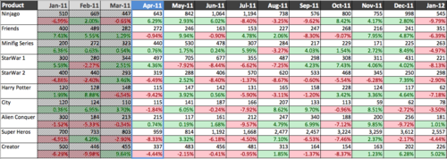
Reports usually act as an essential catalyst within chain of business process for decision making. While in the business class we have learnt that accurate and detail data is the key to make correct decision with precision, yet in reality, the reports usually end up with huge matrix of metrics which is simply too chaotic for human eyes. Some better ones would have bars charts or trends lines to reflect the data in different dimension, yet all those charts could do is, well, really reflecting the fact, they still lack of a true purpose that would like to help the reader to achieve. In short, they're simply visually and mentally painful for a business person to decide the right decision. And this suggest a very good starting point for our cracking process.


Saturday, 4 February 2012

[How to] Crack a Complex Business Report into Actionable Infographics (Part 2)

how-to-crack-a-biz-report-into-infographic-2

Three weeks after the first part, the second part is finally ready!


Last time we have talked about how to deal with the problem by starting from "something very painful" and cracking down stuff by how users read and think, this time, we put our focus into the real thing, designing and drawing.


Enjoy. :)


------------


If you still remember the Part 1 story, my friend CB had seek for some enlightenment for dealing with a complex business dashboard with simple infographics, and with some experience in such field, I have started to crack the problem using the following workflow:

  1. Start with something *very* painful
  2. Learn no Objective but how Users Read and Think
  3. Nailing down the Metrics and Design
  4. Time to Draw Lines, Circles and Squares
  5. Design Actions Triggers with Arrows
  6. Start Presenting (with or without Real Data) !! 


(still remember our painful dashboard?)