how-to-crack-a-biz-report-into-infographic-1
Three weeks ago my friend CB, who is currently working as a Logistics Analyst, has somehow given me a "quest" during a late night coffee break: to find a way to "translate" a complicated business report into infographics. Have been an Digital Analyst and practicing consultation using graphical representation for years, I had taken the chance, spent 2 hours on the problem, cracking it and visualizing it with simple charting on a piece of paper, and pens of three different colors. At the end, he looks quite satisfying, although he keeps finding ways to disprove my method with real data that he didn't disclose to me (what a Stat. geek, still he couldn't make it through even till now. haha.)....
Honestly i don't know if that piece of infographic is the best solution to the problem, nor if he would put it into a good use during decision making process (i highly recommend this one though... XD), still i find that "2-hour translation" seems promising to me for future consultation, plus i somehow find no one have formulated any simply framework on this area (apart from the Napkin, yet which i think its workflow still have rooms for simplifying), so i have spent the following weeks to decode it into simple steps, and try to teach it to anyone who have an interest in cracking business problem with infographics. If you're currently reading this, lucky you, you will be the first who learn the tricks behind (LOL).
Let's get started. Enjoy. :)
--------
The workflow is indeed quite simple, yet a bit different from what you may find in the market. Traditionally people start from a "Question" from the user or client, but based on my previous experience, for most of the time the clients were either asking wrong questions (which gives us a wrong lead), or they simply don't know what to ask, because usually the problem is too complicated for any human being to describe verbally. So how can we know what problem to tackle? Easy, start from something very painful.
Step #1 Start from something *Very* Painful
Usually, the mid-management knows this well. Remember those monthly Excel dashboards with hundreds of metrics which takes you or your junior colleagues weeks to fill all the cells and requires you, as the manager, to make important decisions based on that massive and overwhelming data? That's exactly why my friend CB cried for help... take a look with the following spreadsheet (with mock-up data) and you will understand.... to make thing easier to understand, i use Lego's products to replace CB's company product lines..... (Disclosure: I'm a die-hard Lego fan !! XD)
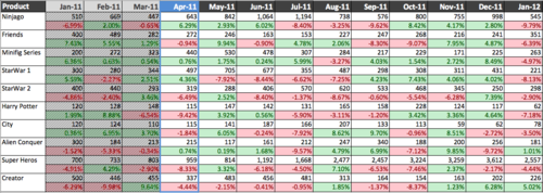
Without a word, you should already feel how painful it is (even we know that its data is fake....).
Me: So your team need to read this every month?
CB: Yes. And we need to decide if we need to re-allocate any resources for certain product lines... (takes note on this key objective, we will talk a bit more in later section)
So a painful process followed by a even more painful decision to make, and both cannot be escaped, every month... Just like in last century (even nowadays), when people find some routine and repeating processes painful, they ask their IT to automate it. And regardless how much the automation has been done, even partially, you will start feeling yourself being more productive (and indeed you're) because you've relieved yourself from a painful manually task. Infographics benefit in the same way,and particularly helpful on smoothening mental fatigue. In order to make the problem that "burying deep underground" more visible, tackling painful process would definitely a good start for us before dealing with the real problem.
Without hesitate, i asked,
Me: ... Okay, tell me How do you read *this thing* and How do you decide an action?...
Step #2 Learn no Objectives but how Users Read and Think
Let's start from the basic: understanding what (the hell) is going on (on the dashboard).
To make it short, here's the break down of all essential components in the above spreadsheet that CB spent 20 minutes to explain to me.....
- Each Row representing a product line
- Two cells will be shown under each month (for each product), the upper with white background is Sales, while the Red/Green one is the YTD Fulfillment rate
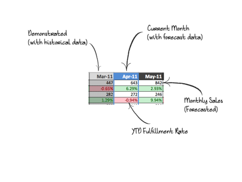
- Shaded areas are "Demonstrated items", which means they're history, actual and happened. for the rest, ALL ARE FORECASTED data (based on certain secret algorithm of their own... XD) which changed every month.
- The Blue column is the "Current Month"
- Sales, as named, the amount of sales achieved/forecasted of that month
- YTD Fulfillment Rate (FR) is the key metric, it is calculated by YTD Sales over YTD Budgeted Sales, the YTD Sales would be partially "Demonstrated" and partially "Forecasted". Budgeted Sales is somewhat a "target" that set at the last year end.
- As manufacturing resources are planned in advanced, they're used for the forecast of Budgeted Sales
- the usage of YTD FR is thus obvious - how well is the current (forecasted) demand fits the original supply plan?
Me: OMG, man, you guys use *this* (the spreadsheet) every month?!
CB: Yes, we usually print it as a large poster and discuss it in the board room...
Well so now we know that It's not just a spreadsheet, but a matrix with trends and forecasts and budget optimization flags and never-understandable prediction calculations...... how shall we kickstart? Here's the easiest, yet most people forgot, trick: Thinking in the Users' shoes.
Me: Well, okay. Tell me how you *read* this.
Again a summarized version from CB (well another 20 minutes...):
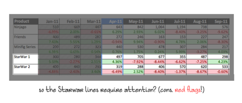
- we look for FR blocks with consecutive colors (says a chain of 4 red FR) for under/over- sales trend
- we then see how their Sales changes in the corresponding months
- finally we decide how to reallocate the (manufactory) resources from under-sold (low market demand) products to over-sold one (high market demand)
- we usually use this to plan for resources for the coming 6 months.
Me: How about the demonstrated items?CB: No, they won't affect our planning since they're already "happened".
Great, so not everything on the spreadsheet is needed indeed ! But don't stop here, even though you seem already get the scope of the problem, make sure you have asked the following question at the end:
Me: So if you guys have decided to change or execute something after reading this (spreadsheet), how long it takes for the action?
CB: 2 months, that's the minimum lead time we need to take the action.
Me: If so, can i assume the coming 1 and 2 month data may not be useful to you simply because you don't have the time to react for them?
CB: True.
We begin getting not just a clearer picture, but a more focused scope of the problem (that actually need to be solved). And if you haven't got confused yet (and clap for yourself if you really aren't!), you will find that the original objective - to "re-allocate resources for certain product lines...", is indeed too abstractive when comparing to how the user actually interacts with the dashboard (particularly, how they read, and think). This is also a typical problem that business people would frequently encounter, by cracking down a very top-level problem and then realize that it may not be solvable when down to the bottom-level. If putting Software Engineering terms into this scenario, this will be what an engineer called a proper Use Case, and building any solution around an Use Case will never go wrong because you've already put the problem as the focus.
So now we've understood the problem, and learnt about how user interact with the dashboard, next time we will start talking about metrics selection, and of course, the design of the infographics.... ;)
Lastly, here's a sneak peek for the coming sections ([Updated on 5th Feb] Part 2 is out now!!):
- Step #3 Nailing down the Metrics
- Step #4 Time to Draw lines, circles and squares
- Step #5 Design Actions Triggers with Arrows
- Step #6 Start Presenting (with or without Real Data) !!
Stay tuned, and Good Night. :)
Cheers,
Dickson
P.S. if you have any business problem, particularly have any complicated-yet-important report that you would like to "simplify", drop me a mail at skeletonwong@gmail.com, your case may be featured on here!
*IMPORTANT NOTE: all data that me and CB have discussed, on this post and the coming ones are FAKE. My friend CB has protected his company confidentiality very well indeed, and NO REAL DATA has been leaked to anyone throughout the whole process !!*
No comments:
Post a Comment