how-to-crack-a-biz-report-into-infographic-2
Three weeks after the first part, the second part is finally ready!

Three weeks after the first part, the second part is finally ready!
Last time we have talked about how to deal with the problem by starting from "something very painful" and cracking down stuff by how users read and think, this time, we put our focus into the real thing, designing and drawing.
Enjoy. :)
------------
If you still remember the Part 1 story, my friend CB had seek for some enlightenment for dealing with a complex business dashboard with simple infographics, and with some experience in such field, I have started to crack the problem using the following workflow:
- Start with something *very* painful
- Learn no Objective but how Users Read and Think
- Nailing down the Metrics and Design
- Time to Draw Lines, Circles and Squares
- Design Actions Triggers with Arrows
- Start Presenting (with or without Real Data) !!
(still remember our painful dashboard?)
As a short recap, we have already nailed down the scope of the data viewpoint (i.e. how the user reads) and the concept and intention behind the dashboard (i.e. how the user thinks), so it's time for us to go further, picking the right metrics.
Step #3 Nailing down the Metrics and Design
It's always easy for anyone to select metrics for any reporting, and if you've been in the management level for long, you would already know that most of the time, people simply pick ALL METRICS that they could think of. You can't say they're wrong, because what they're doing is really "reporting". Well.
Step #3a Picking Key Metrics, Selectively
On the other hand, Analysts or Consultants would usually be more good at picking so-called "right metrics" or sometime "custom metrics", while i believe in their expertise, still, we (i am an analyst indeed....) usually been found that using still-too-many metrics for one single problem. Think of measuring the performance of a website, how many so-called key-metrics we would have? Conversions rate? Checked. CPC? Checked. Engagement index (obviously, a custom one)? Checked. Multi-channel conversion depth? Well, sadly, checked also. Don't blame us, because "we" really think that ALL these metrics are important (otherwise we won't call all of them "keys".
Trust me, such mindset is really a proficiency (and we, as consultant do proud of it too, haha), yet, we're here to help crack a problem instead of overwhelming anyone (including ourselves), thus we shall have a different approach in our case.
And indeed, the solution is quite simple. Again, just start from what and how users read, and pick only those existing and relevant.
(if you have forgotten how the user, my friend CB, told us how they read the dashboard, i strongly recommend you to take a visit to Part 1 again, or even read it along with Part 2 side-by-side if necessary before going further, as the story continues from where it's ended....)
Me: So, based on how you guys read this *thing*, the Fulfillment Rate is definitely a must-have metrics?
CB: Yes, especially its trend in coming months.
Me: also the Sales?
CB: Well yes, but usually guts-feeling based on (forecast) numbers in consecutive months
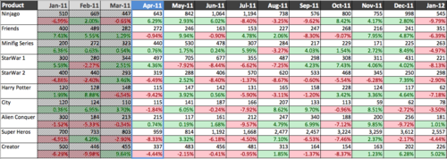
Based on what the user focuses, we have already dug up two important metrics with two dimensions, product line & time (trend or in other words those "consecutive monthly numbers"):
- Monthly YTD Fulfillment Rate (YTD-FR)
- Monthly (Forecasted) Sales
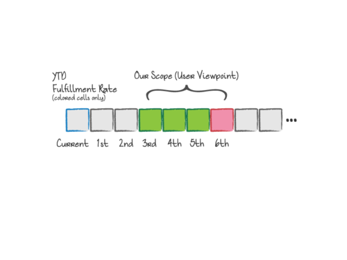
- Scope: 3rd to 6th month prior to current one
Step #3b Thinking about the Graph (in advanced !)
But hey, don't finalized anything yet (and we're far from that indeed). If those two metrics are really that good, the original dashboard would already be doing fine! Plus, selecting the right metrics will definitely affect how we draw the graph, so don't hesitate to ask if the user has tried anything (particularly failed attempts):
Me: and i guess you have already tried plotting this with Trend Charts?
CB: well, Dickson, no one would want to deal with a Charts with twenty-or-something trend lines......
Take notes on CB's comments, because that's one of the trap we always fall into: whenever we encounter something expressing in "different time period", we have been somehow "trained" in school to use the trend chart, and in the practical world, a trend chart like this (with 20 something trends) is indeed pretty useless because its visual-complexity. Which also means that we may need another type of graph which can leverage the same set of metrics.
Now take a step backwards, what's the true problem that CB's facing? Reallocating resource.
Before this? Decide allocating from which (product line) to which (another product line).
And before this? Comparing among items before decide the first and second "which".
Simply speaking, Comparisons between items, or a fancier word, Benchmarking.
Me: Sorry for my forgetfulness, you guys read this dashboard and make decision only once a month?
CB: Yes, and forecasts are updated *every* month.
A simple translation means: every month the trends are different, as all data except the demonstrated ones are different.
In other words, every month, the user only reads a *Snapshot* of forecasts.
Any chart is good for benchmarking as snapshot? Obvious, a Map.
Step #3c Tuning the Metrics
If you haven't be familiar with a Map chart already, you could spend some time on "Behind the Napkin", as the author himself has provided a very detail explanation on how a Map works out in solving "problems in space". Without drilling too much into that book, my personal interpretation on a Map Chart is that it provides information regarding *positions* of selected *items*, and because its geometrical nature, it is very good at visualizing the "difference" between items simply by plugging in different metrics into the two x and y axis (a.k.a. a scatter chart in excel). Such chart support very powerful framework for customization, and some popular variations, including bubble map (instead of points, we use circles with its size representing the 3rd metrics) or even the Motion Chart from Google charting api (with 4th metrics, time, included, for time-based animation) are already well used.
As a side-story, I still remember the first bubble map chart i used (hm... actually i proposed to my previous boss who hired me as Digital Specialist without having any actual marketing experience before.... XD) is showing the different nature between social forums in Hong Kong, with volume of buzzes generated, average sentiment and engagement level as the three metrics, in order to strategize our digital marketing plan for clients. Before that the team uses "experience" or mainly "feeling" to plan for marketing efforts, yet after the map has released, we could clearly tell how to engage on which online community using what approaches based on what clients need. And after that, I got "recognized" in the first week of joining. :P
Back to our main plot, it became quite obvious for me to give Map chart a try, still we have to solve another "technical" problem, which is, unless it is a Motion Map, otherwise the Time dimension would be missing. To make sure we're on the same track, here's what we currently have:
- Monthly YTD Fulfillment Rate (YTD-FR)
- Monthly (Forecasted) Sales
- Scope: 3rd to 6th month prior to current one (as user can only take actual action after two months as mentioned in Part 1)
Any method to abstract a trend into a single number? Yes, Averages.
By using Averages (i.e. Sum of (3rd to 6th YTD-FR) / 4), we will not only be able to abstract the 3rd-6th month trend by a specific position (certain point on the map). Such calculation would also provide a similar nature as moving average (as it always takes 3rd to 6th month into account), which is always reflecting trend lagged behind the reference points (the 3rd - 6th month in this case). Lagging a forecast number is, well, sounds "usable", so why not use it as the estimation?
The second tuning comes to (Forecasted) Sale. Like normal retail, different product line would have different demand, pricing strategy and even marketing budget, depending on whether it is a star product and a lot other market variations. For example, Lego will always invest more in product quality for Star War series as it's a themed line, along with the brand (Star War) popularity, usually this line sells at a premium than normal System series like City or Kingdom and of course sell more as well (hence higher revenue, or sales). To minimize such effect, particularly, to ensure we are comparing apple to apple, I have decided to change Monthly Sales into Month-to-Month (Forecasted) Sales Changes (%).
- 4-Months Average of YTD Fulfillment Rate (3rd-6th month)
- 4-Months Average of MoM (Forecasted) Sales Changes (3rd-6th month)
Good, so we (almost) have a Map now (with each of them representing x and y axis), but still we have one last step to go....
Step #3d Tuning the Graph
I started drafting a Map chart with those two metrics on a piece of paper along with some explanation...
(Tips: During consultation, whenever i make any "progress" in my mind, i usually ask a question "how do you feel about this?" this keeps things on the right track and of course keeps your clients think that you're on the right track too... LOL)
Me: CB, how do you feel about this?
CB: Hm.... nice try. But how about the Fulfillment Rate? I still think that its trend is important. You remember we take notes on whether its under- or over- sales by its color ? (Red = less than 100% FR and Green = more tha or equal to 100% FR)
That was closed, I almost forgot the FIRST STEP of how the user reads the chart, the consecutive color blocks. Oh wait, color blocks? Not the numbers?
Me: Hey wait, tell me more about is the Fulfillment Rate ...
By that time i know that i need to understand more regarding how the user "proceed" the information from Fulfillment Rates... so...
Me: I think a 90% FR and 70% FR are just a difference in magnitude to you (both are Red in color)?
CB: Yes.
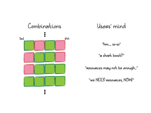
Me: Then, what if a product has 70% 120% 70% in three consecutive month (Red, Green, Red), while the other one has 90% 90% 90% (Three Reds in-a-row), which one do you think require most of your attention?
CB: Tough one, but usually we deal with the 2nd one (with 3 Reds in-a-row) first. Why ask?
Bingo ! The missing puzzle ! By asking user's feedback on "scenarios", we can now tell confidently the (Fulfillment Rate) trends is somewhat more determinative to user than numbers, and it also provides us a clue and inspiration on how to bake such information along with our Map. Let's start designing the last piece of the puzzle !
Step #3e Defining Visual Components
Remember a Map is always customizable, especially the "items" that display on it? So instead of using dots or points to indicate the position of the fulfillment-and-sales forecast of a product line on the 2D Map, how about we use something visual and indicative, hm, says, color blocks?
Each product line will have their own "Light Box" (Tips: make a name for each new thing you've designed, this helps to build common ground with user and ease further discussion), and each box contains 4 "Light Blocks", and each block is either Red or Green, reflecting exactly the same color of the YTD Fulfillment Rate in 3rd to 6th (from left to right).
Now each Box would have a total 16 combinations, and each combination will be a snapshot of the YTD-FR during 3rd to 6th month. Even better, these patterns is synchronized with users' understanding to existing dashboard, because, indeed, we just extract the colored cells from their dashboard, right? XD
Tips: If you ask me why i pick the Light Boxes design, honestly, i really can't tell, it somewhat like a *blink* to me... But reading more infographics from different designers would definitely help you to sharpen your intuitive in using the right shapes. A good place to begin with is of course visual.ly, where you could find a lot of cool infographics for reference. A more advanced source would be visualizing.org, some of those infographics are even interactive! Draw or sketch for whatever problems would also help strengthening and developing your own visual-solving mindset. Maybe i could write a short post regarding my practice later. :)
Me: CB, how's that?
CB: Looks clean and effective. So what's next?
Me: Let's start drawing.
Step #4 Time to Draw Lines, Circles and Squares
Let's see what we have now:
- 4-Months Average of YTD Fulfillment Rate (3rd-6th month)
- 4-Months Average of MoM (Forecasted) Sales Changes (3rd-6th month)
- LightBoxes with 4-Months YTD Fulfillment Rate (3rd-6th month)
For each Product Line itme with coordinate (x,y), we can easily use the following mapping...
- y - YTD-FR Average
- x - MoM Sales Changes Average
- icon - LightBox
How about the coordinates? Especially, what is the cross-ed point of two axis? Let's think about at which point those metrics will change their "sentiment" from "negative" to "positive":
- y - YTD-FR Average : Range from 0% to +infinite, cells turn from Red to Green at 100%
- x - MoM Sales Changes Average : Range from -infinite to +infinite, while a -ve changes is definitely not a good sign, and vice versa +ve changes is always good, thus 0% is the middle ground.
Obviously, a (0,1) is a good origin of the map.
Every piece of the puzzle is ready, just some more drawing.... and.... this is IT !
(I used Blue instead of Green btw.)
Finally !!
Everything is well-placed and it looks quite promising for analysis, especially now every product line has it forecasting situation nailed down on the map, and we can now easily tell which would be doing better or not (see the arrow? no worry if you can't figure the "why" out now, i will cover this in next part). But wait, although we've mapped all the items, how can we tell which product line should we reallocate resources from/to ? Is there anything more than just answering this single question from this infographics ? How can we "embed" this chart back into user's existing business process (i.e. making decisions) ?? How to make this infographic actionable?
Next time in Part 3, we will talk about how to formulate the decisions making rules based on the infographics we have designed such that the graph itself can become part of the whole business process. We will also cover how to evolve or create alternative graphs based on user's feedback in order to leave rooms for users to design the "final version".
Make sure you comment below if you find yourself have learnt something here ! Subscribe me or even connect me if you wish to !!
Oh, forget to mention, it's Chinese Lunar New Year now, so, Kung Hei Fa Choi (Good Luck & Good Fortune) !!
Cheers,
Dickson
No comments:
Post a Comment