6-steps-to-crack-a-biz-report-into-infographic
After the release of
Part 1 and
2 I've so much positive feedback from friends, and the most asked question from them is "When the Part 3 will be released?"... Well, sorry to say, as start getting busy because of a huge analytics project from a key account, plus as in my draft, the last part would involve relatively more images to demonstrate the "Action Triggers" design, so i guess it would take a few more weeks to bake the stuff. But i guess we have no point to cool down and stop learning about this field, right? So let's have a short step-by-step guides as an overview before the last part!
6 steps, are really all we need to make an actionable
infographic for analytic.
---------------------------------------
1. Start with something *very* painful
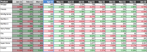
Reports usually act as an essential catalyst within chain of business process for decision making. While in the business class we have learnt that accurate and detail data is the key to make correct decision with precision, yet in reality, the reports usually end up with huge matrix of metrics which is simply too chaotic for human eyes. Some better ones would have bars charts or trends lines to reflect the data in different dimension, yet all those charts could do is, well, really reflecting the fact, they still lack of a true purpose that would like to help the reader to achieve. In short, they're simply
visually and mentally painful for a business person to decide the right decision. And this suggest a very good starting point for our cracking process.