5-Lessons-DrawSomething-teaches-on-Visualization-for-Presentation
Draw Something is now one of the hottest apps in the world, and have just secured its 5,000,000 downloads a few days ago. The trend has reached Hong Kong recently, so i have given it a chance and see how it works. The game play is definitely fun and engaging as mentioned by the reviews, but what surprised me is that, the draw-&-guess model, or simply "the Pictionary game", is indeed involving some quite important concept that one could easily leverage for more effective presentation through abstractive drawing. Here's some tricks that you may find useful (for presentation or just getting more coins in Draw Something!!).
Enjoy. :)
Showing posts with label infographic. Show all posts
Saturday, 3 March 2012
Thursday, 23 February 2012
Advanced Multi-Channel Funnel Analysis using Google Analytics
Advanced-Multi-Channel-Funnel-Analysis-using-Google-Analytics
Multi-Channel Funnel has been in Google Analytics for a while. Although by searching "Multi-Channel Analysis" you could find a lot of great how-to articles to leverage this powerful function, but seldom of them have explored the opportunities in using it for better resources allocation decision based on ROI estimation, particularly, using Assisted Conversions. Hence, i have decided to put together my experience in marketing, analytic, and infographic to demonstrate the following analytic model. Enjoy.
(Disclosure: i am currently working at MRM Worldiwide, a Digital Strategy agency under McCann WorldGroup, and hopefully the following model will be used in our service someday.....so........ have fun ! XD)
A Closer Look to Assisted Conversion
....
Multi-Channel Funnel has been in Google Analytics for a while. Although by searching "Multi-Channel Analysis" you could find a lot of great how-to articles to leverage this powerful function, but seldom of them have explored the opportunities in using it for better resources allocation decision based on ROI estimation, particularly, using Assisted Conversions. Hence, i have decided to put together my experience in marketing, analytic, and infographic to demonstrate the following analytic model. Enjoy.
(Disclosure: i am currently working at MRM Worldiwide, a Digital Strategy agency under McCann WorldGroup, and hopefully the following model will be used in our service someday.....so........ have fun ! XD)
A Closer Look to Assisted Conversion
Apart from the Multi-Channel Funnel view in Google Analytics, Assisted Conversion Report is the one that we are looking for. If you have some experience in Omniture, you would know that Assisted Conversion is indeed having similar logic as Participation Variable, a way to estimate the potential value that a particular entity, exists within a funnel of process, has driven. For example, if a visitor purchase a dress online after she visit a review on a forum (outside the eshop), both our eshop and the external forum will be entitled to have contributions, in terms of conversions and revenue, counted towards themselves, either evenly (all entities have the same value) or linearly (all entities gain the average of value gained, only in Omniture), demonstrating that how the entity "participate" within the whole conversion path.
![]() |
| A snapshot of Assisted Conversion Report of my groupbuying site: Cheapppy |
....
Thursday, 16 February 2012
6 Steps to Crack a Complex Business Report into Actionable Infographics
6-steps-to-crack-a-biz-report-into-infographic
After the release of Part 1 and 2 I've so much positive feedback from friends, and the most asked question from them is "When the Part 3 will be released?"... Well, sorry to say, as start getting busy because of a huge analytics project from a key account, plus as in my draft, the last part would involve relatively more images to demonstrate the "Action Triggers" design, so i guess it would take a few more weeks to bake the stuff. But i guess we have no point to cool down and stop learning about this field, right? So let's have a short step-by-step guides as an overview before the last part!
6 steps, are really all we need to make an actionable infographic for analytic.
---------------------------------------
1. Start with something *very* painful
Reports usually act as an essential catalyst within chain of business process for decision making. While in the business class we have learnt that accurate and detail data is the key to make correct decision with precision, yet in reality, the reports usually end up with huge matrix of metrics which is simply too chaotic for human eyes. Some better ones would have bars charts or trends lines to reflect the data in different dimension, yet all those charts could do is, well, really reflecting the fact, they still lack of a true purpose that would like to help the reader to achieve. In short, they're simply visually and mentally painful for a business person to decide the right decision. And this suggest a very good starting point for our cracking process.
After the release of Part 1 and 2 I've so much positive feedback from friends, and the most asked question from them is "When the Part 3 will be released?"... Well, sorry to say, as start getting busy because of a huge analytics project from a key account, plus as in my draft, the last part would involve relatively more images to demonstrate the "Action Triggers" design, so i guess it would take a few more weeks to bake the stuff. But i guess we have no point to cool down and stop learning about this field, right? So let's have a short step-by-step guides as an overview before the last part!
6 steps, are really all we need to make an actionable infographic for analytic.
---------------------------------------
1. Start with something *very* painful
Reports usually act as an essential catalyst within chain of business process for decision making. While in the business class we have learnt that accurate and detail data is the key to make correct decision with precision, yet in reality, the reports usually end up with huge matrix of metrics which is simply too chaotic for human eyes. Some better ones would have bars charts or trends lines to reflect the data in different dimension, yet all those charts could do is, well, really reflecting the fact, they still lack of a true purpose that would like to help the reader to achieve. In short, they're simply visually and mentally painful for a business person to decide the right decision. And this suggest a very good starting point for our cracking process.
Labels:
analytic,
business,
infographic,
visualization
Saturday, 4 February 2012
[How to] Crack a Complex Business Report into Actionable Infographics (Part 2)
how-to-crack-a-biz-report-into-infographic-2
Three weeks after the first part, the second part is finally ready!
Last time we have talked about how to deal with the problem by starting from "something very painful" and cracking down stuff by how users read and think, this time, we put our focus into the real thing, designing and drawing.
Enjoy. :)
------------
If you still remember the Part 1 story, my friend CB had seek for some enlightenment for dealing with a complex business dashboard with simple infographics, and with some experience in such field, I have started to crack the problem using the following workflow:
- Start with something *very* painful
- Learn no Objective but how Users Read and Think
- Nailing down the Metrics and Design
- Time to Draw Lines, Circles and Squares
- Design Actions Triggers with Arrows
- Start Presenting (with or without Real Data) !!

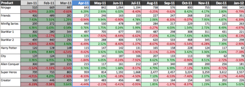
(still remember our painful dashboard?)
Labels:
analytic,
business,
infographic,
visualization
Wednesday, 1 February 2012
[How to] Crack a Complex Business Report into Actionable Infographics (Part 1)
how-to-crack-a-biz-report-into-infographic-1
Three weeks ago my friend CB, who is currently working as a Logistics Analyst, has somehow given me a "quest" during a late night coffee break: to find a way to "translate" a complicated business report into infographics. Have been an Digital Analyst and practicing consultation using graphical representation for years, I had taken the chance, spent 2 hours on the problem, cracking it and visualizing it with simple charting on a piece of paper, and pens of three different colors. At the end, he looks quite satisfying, although he keeps finding ways to disprove my method with real data that he didn't disclose to me (what a Stat. geek, still he couldn't make it through even till now. haha.)....
Honestly i don't know if that piece of infographic is the best solution to the problem, nor if he would put it into a good use during decision making process (i highly recommend this one though... XD), still i find that "2-hour translation" seems promising to me for future consultation, plus i somehow find no one have formulated any simply framework on this area (apart from the Napkin, yet which i think its workflow still have rooms for simplifying), so i have spent the following weeks to decode it into simple steps, and try to teach it to anyone who have an interest in cracking business problem with infographics. If you're currently reading this, lucky you, you will be the first who learn the tricks behind (LOL).
Let's get started. Enjoy. :)
Labels:
analytic,
business,
infographic,
visualization
Subscribe to:
Posts (Atom)